PRODUCT & UX DESIGN
Onboarding that helps every user become proficient — not just activated.
Most SaaS onboarding treats everyone the same. Adaptive learns each user's role, goals, and experience, then reshapes the journey as it watches how they actually work — so support scales up or down to meet the moment.
THE QUESTION
Not “how do we get users through onboarding?” but “how do we help each user succeed at the right pace?”
DESIGNED AS ONE ADAPTIVE SYSTEM
Every screen shares one idea: the product should observe, explain itself, and adjust. Onboarding, in-product help, proficiency, and the admin tooling are all views into the same adaptive engine — which is what lets a single experience meet a brand-new user and a returning power user where each of them actually is.
WORKFLOW 1: PERSONALIZED ENTRY
01
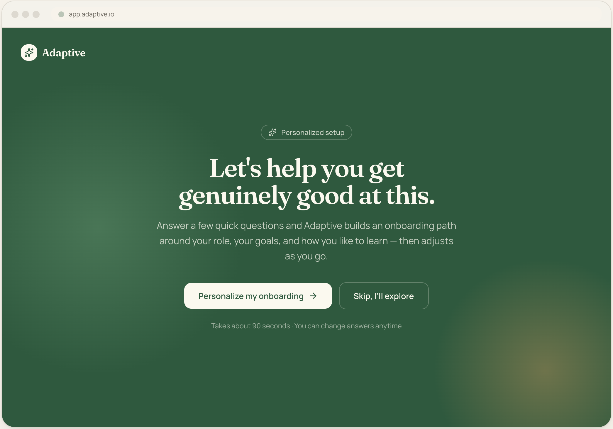
Welcome & onboarding entry
The entry point sets the promise: this is onboarding about becoming good, not just getting activated. A single, confident value statement and one primary action reduce choice paralysis.
Key design decisions:
One primary CTA, one low-commitment escape ("Skip, I'll explore")
Sets time expectation (~90s) to lower the cost of starting
Reassures answers are editable later to remove commitment anxiety
02
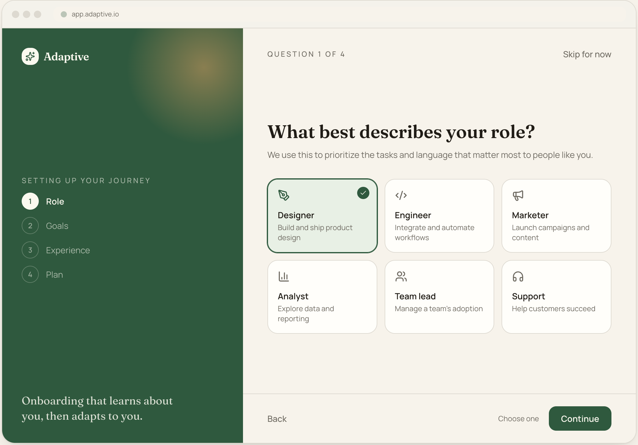
Role selection
Role is the strongest predictor of what a user needs. A persistent step rail shows progress and keeps the questionnaire feeling short (goal-gradient effect).
Key design decisions:
Card grid with icons for fast scanning (Hick’s law: chunked choices)
Selected state uses ring + check, never colour alone (a11y)
"Skip" always available per the requirement to allow skipping questions
03
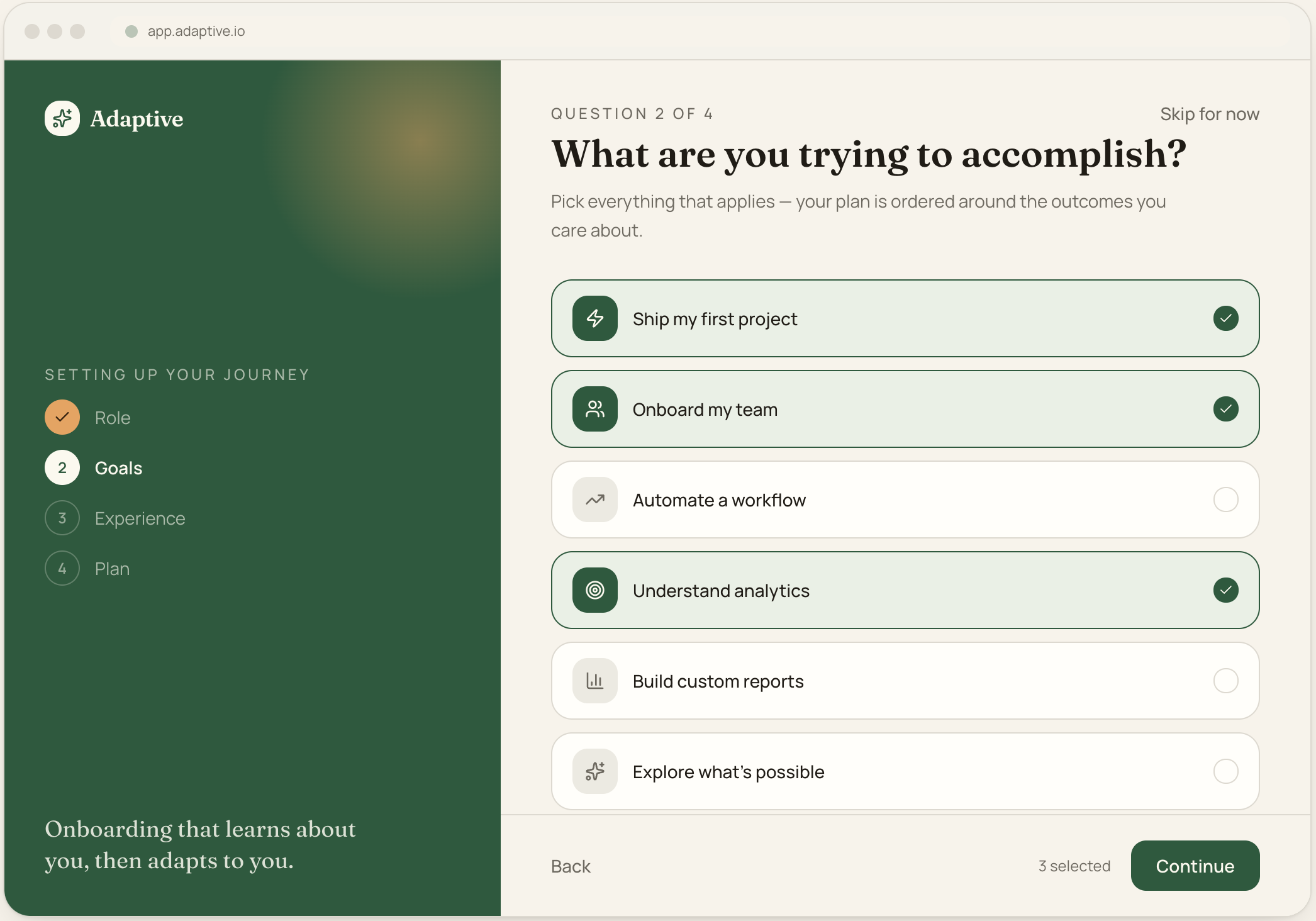
Goal selection
Goals are multi-select because real users want several outcomes. The count in the footer confirms the selection and drives ordering of the generated plan.
Key design decisions:
Multi-select with explicit checkboxes and live "3 selected" count
Each goal maps directly to a task in the generated plan
Language mirrors user outcomes, not product features
04
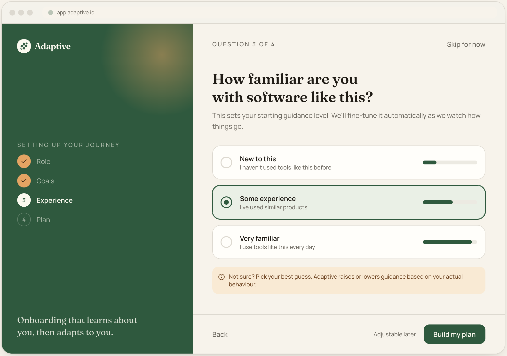
Experience assessment
Self-reported familiarity sets the starting guidance level. The helper note makes clear the system will correct itself, so a wrong guess is harmless.
Key design decisions:
Three plain-language levels instead of a vague slider
Explicitly states guidance auto-tunes from real behaviour
Reduces pressure to answer "correctly"
05
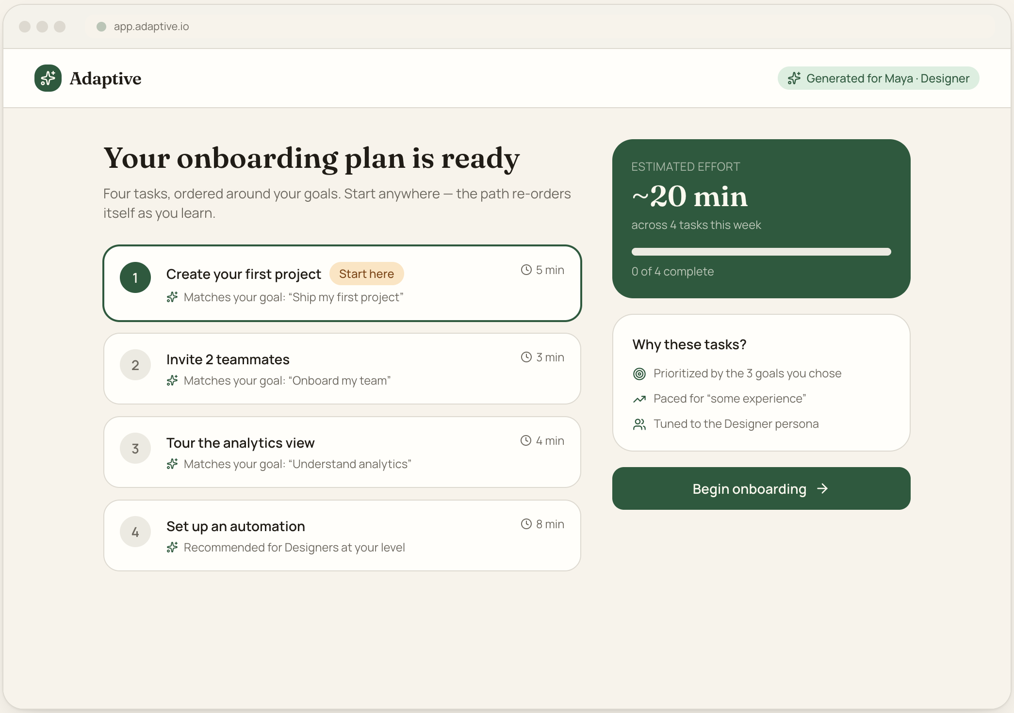
Personalized onboarding plan
The payoff screen. Every task shows why it was recommended and its estimated effort — meeting the requirement to explain recommendations and let users preview the plan before starting.
Key design decisions:
Each task carries a "why" tied back to a chosen goal or persona
Total effort + progress make the commitment concrete (~20 min)
"Start here" highlights a single entry point without locking order
WORKFLOW 2: ADAPTIVE LEARNING
06
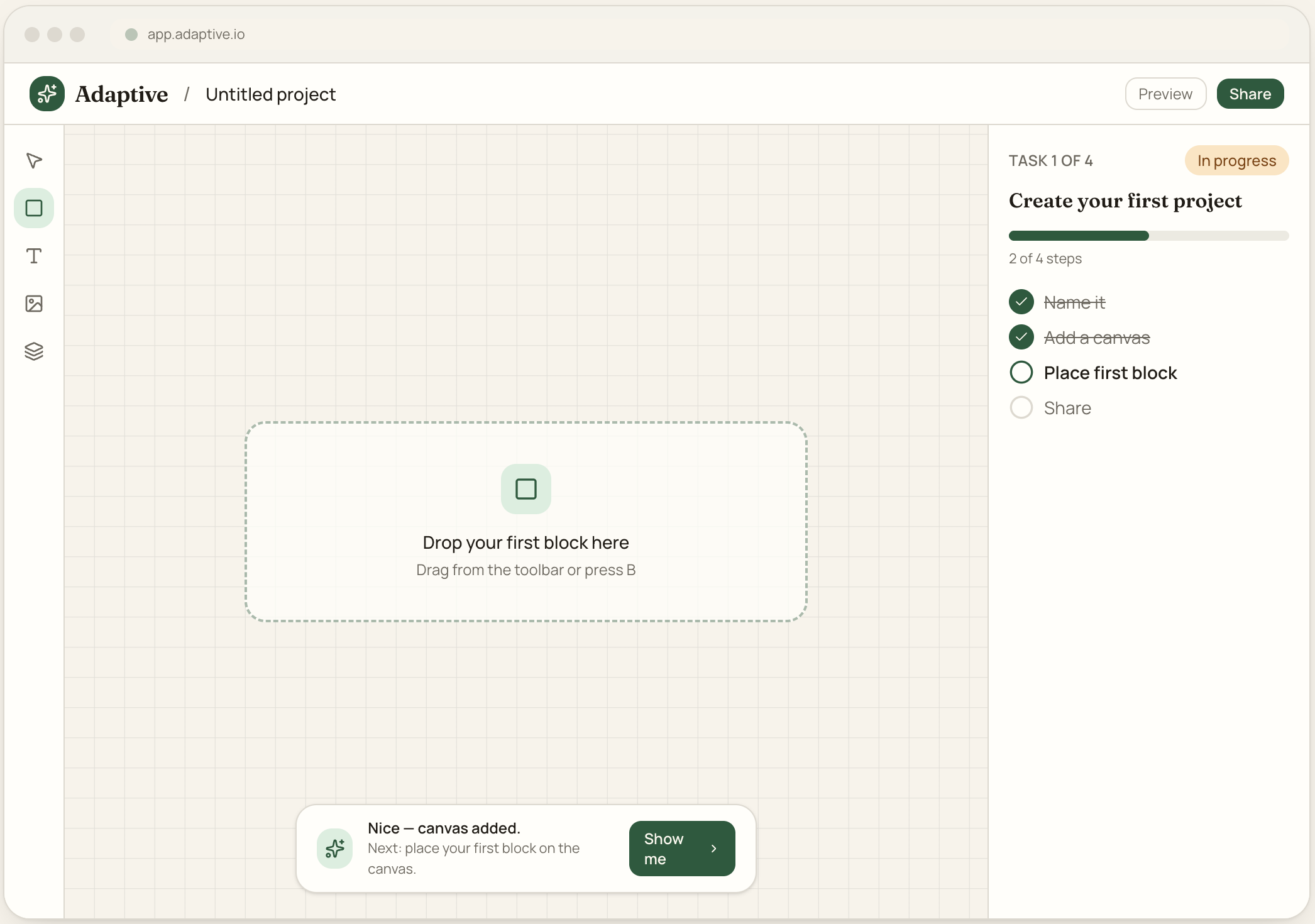
First task
Onboarding happens inside the real product, not a separate tour. A persistent task tracker keeps the goal visible while contextual nudges confirm progress step by step.
Key design decisions:
Learning is embedded in the live workspace, not a modal tour
Right-hand tracker shows step-level progress (Zeigarnik: show incomplete)
Inline confirmation celebrates small wins to sustain momentum
07
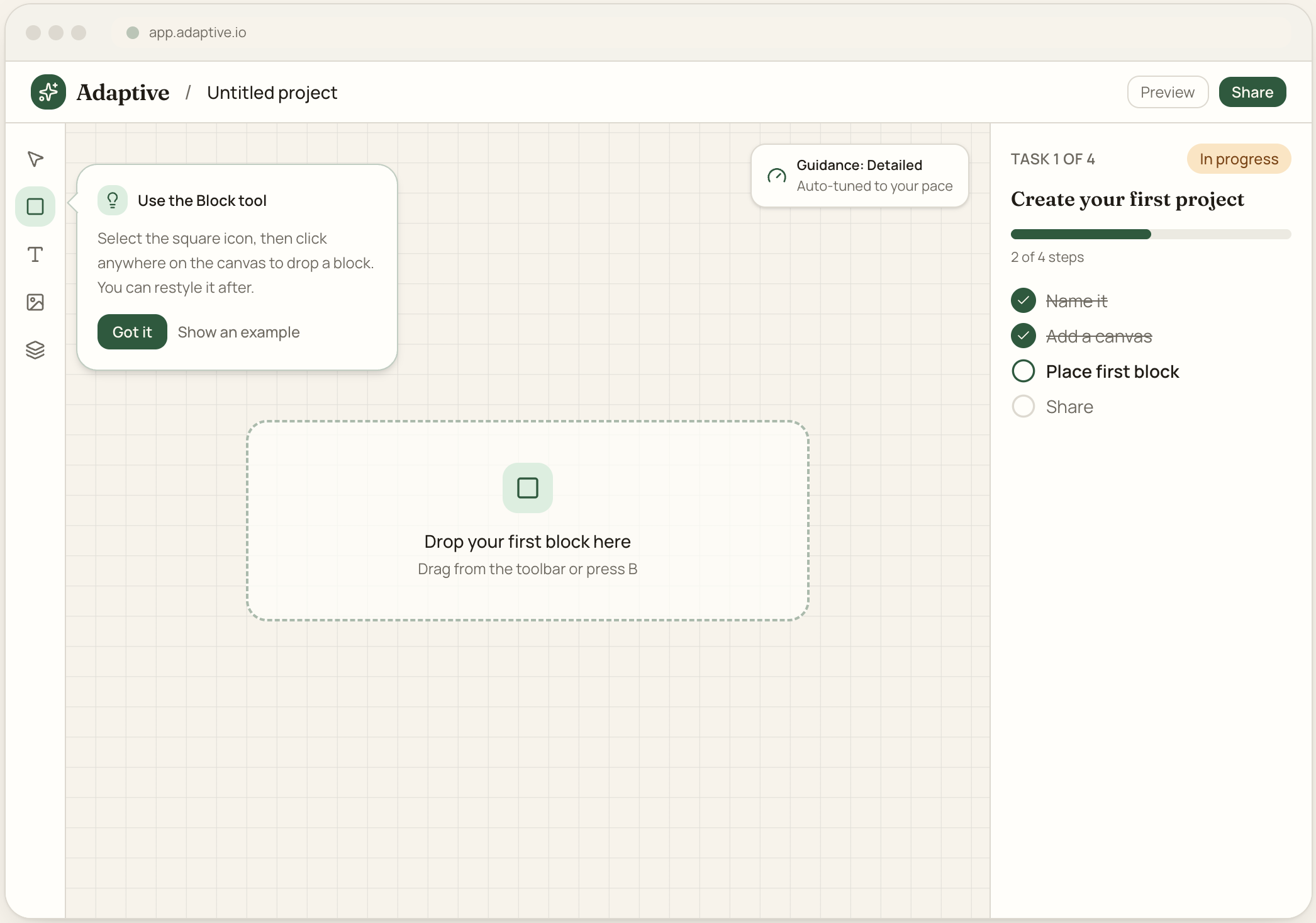
Contextual guidance
Guidance is anchored to the exact element the user needs next, and a visible "guidance level" control shows the system is actively adapting support up or down.
Key design decisions:
Coachmark points to the precise tool — help matches the current step
Guidance-level indicator makes the adaptation legible to the user
Escalation path ("Show an example") sits one tap away
08
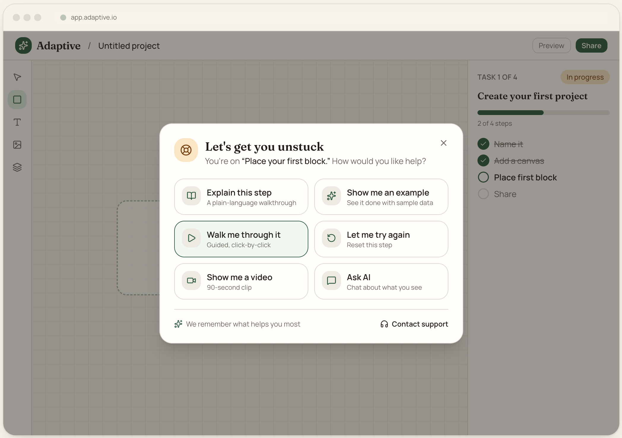
“I’m Stuck” experience
A single recovery affordance surfaces all seven help modes without leaving the product. The system names the current step so help is always relevant to context.
Key design decisions:
Dimmed backdrop focuses attention on recovery (staging)
Lists all support modes; remembers the user’s preferred one
Human support is present but never the first thing offered
09
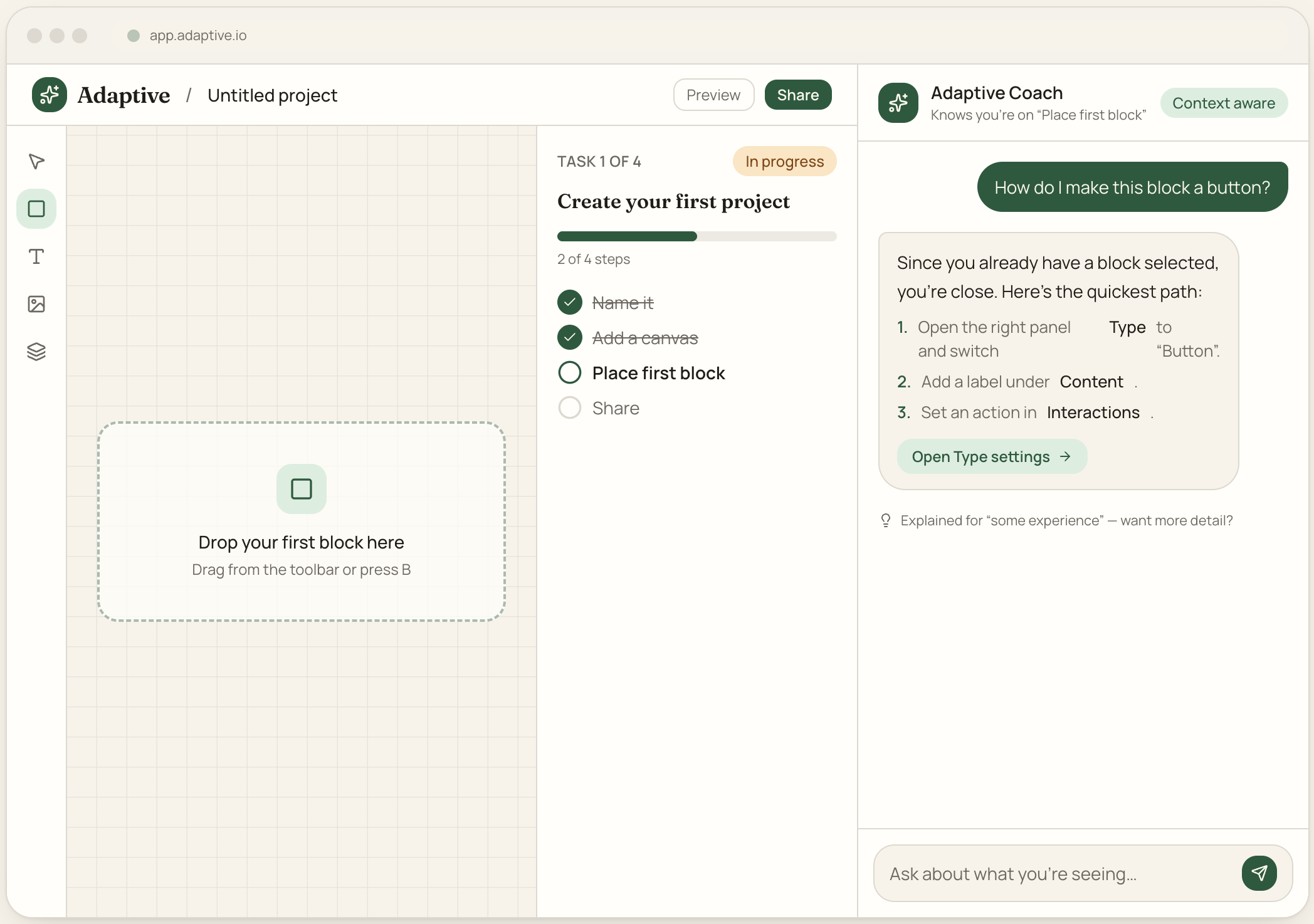
AI coach
The coach is docked beside the workspace and states the exact step it knows about. Answers are step-by-step, scoped to the user’s level, and link directly into the feature.
Key design decisions:
"Context aware" badge + current-step line build trust in the answer
Responses are concise, numbered, and deep-link to the relevant setting
Offers "more detail" instead of over-explaining by default
10
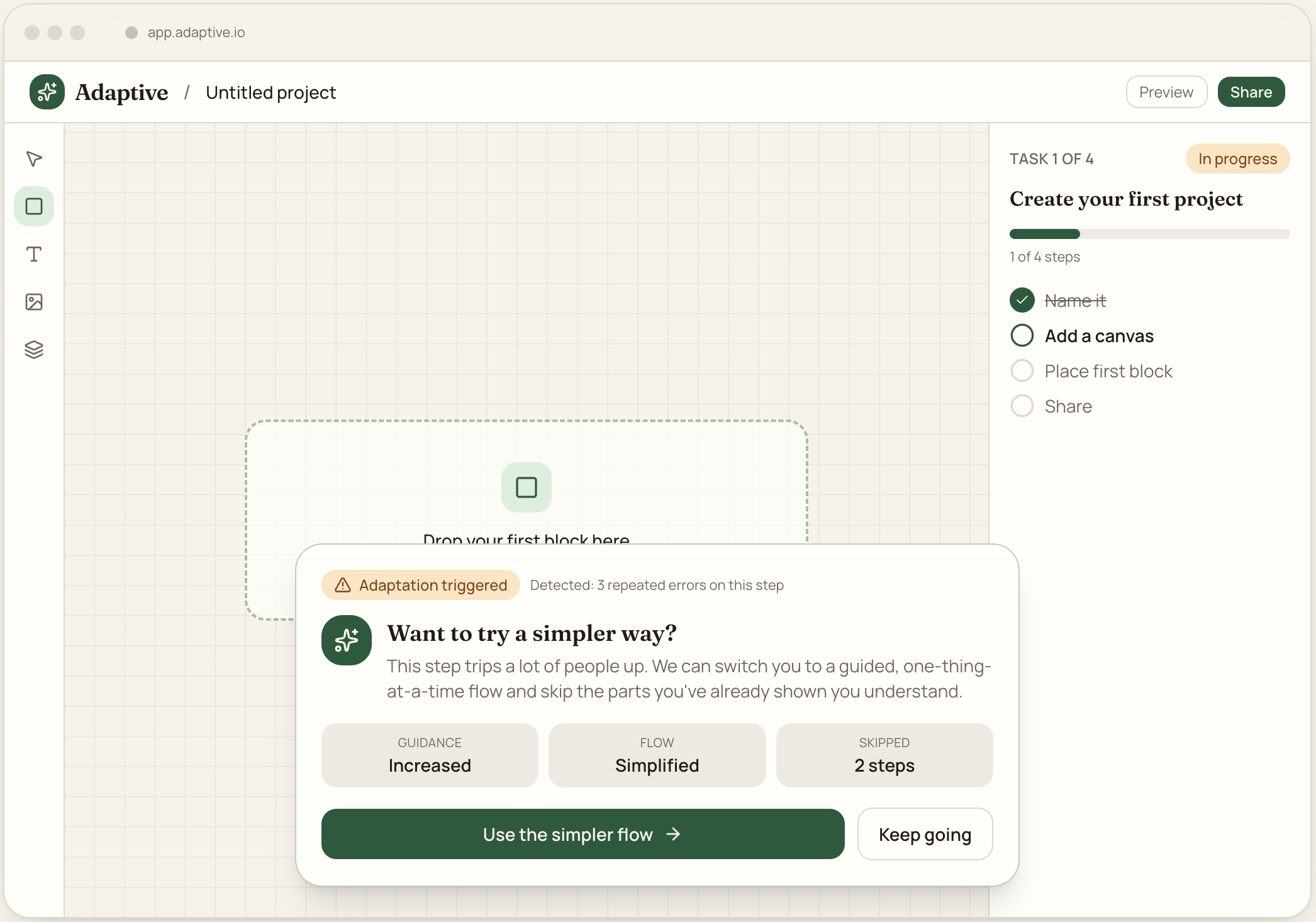
Adaptive recommendation
When behaviour signals struggle (repeated errors), the system proactively offers a simpler path — and shows exactly what it changed, so adaptation never feels like a black box.
Key design decisions:
States the trigger ("3 repeated errors") for transparency
Summarises the adaptation: guidance up, flow simplified, steps skipped
User stays in control — "Keep going" is always an option
WORKFLOW 3: PROFICIENCY & PROGRESS
11
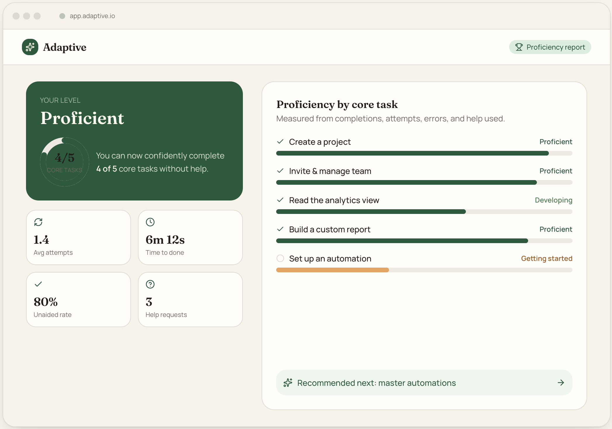
Proficiency assessment
Measures real capability, not checklist completion. The headline "confidently complete 4 of 5 core tasks" reframes success around outcomes, backed by attempts, time, and unaided-completion data.
Key design decisions:
Outcome-first headline instead of a completion percentage
Per-task levels: Getting started → Developing → Proficient → Advanced
Signals whether each task was completed without assistance
12
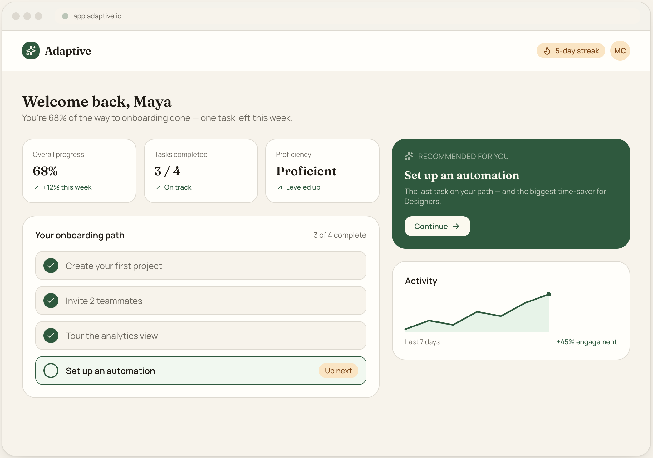
User progress dashboard
A returning-user home that resumes the journey. It leads with progress and the single recommended next task, using streaks and trends to pull the user back toward completion.
Key design decisions:
Foregrounds the one recommended next action (reduce choice)
Goal-gradient progress + streak reinforce returning behaviour
Completed items visibly checked off for a sense of accomplishment
WORKFLOW 4: ADMIN & PRODUCT TEAM
13
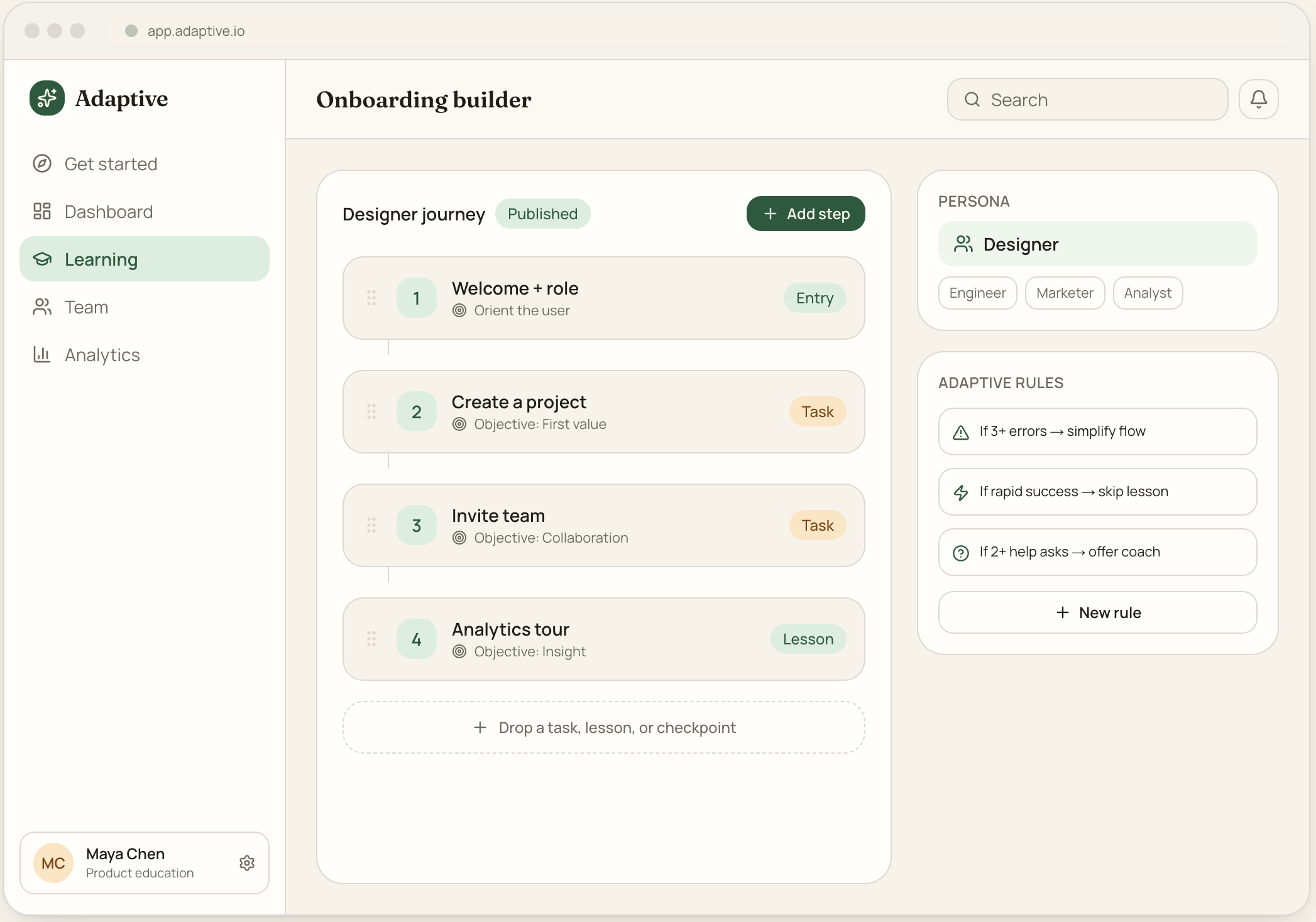
Admin onboarding builder
Lets product-education teams compose a journey by mapping tasks to learning objectives, scoped per persona, with adaptive rules configured alongside — the engine behind everything users experience.
Key design decisions:
Sequential step canvas maps each task to an explicit objective
Persona selector scopes the whole journey
Adaptive rules edited next to the flow they govern
14
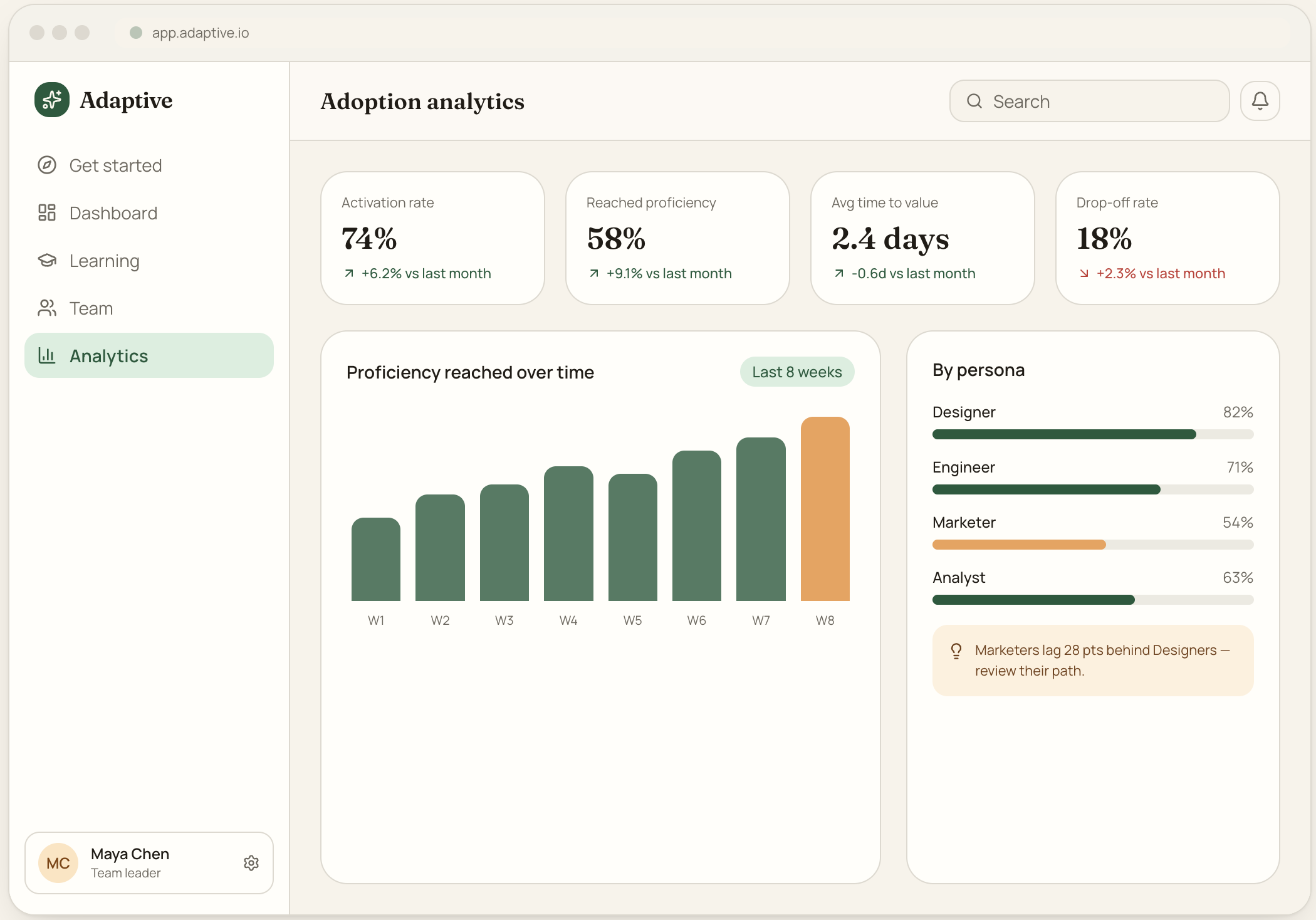
Analytics dashboard
Answers the leader’s question: is my team actually adopting this? Proficiency (not just activation) is the hero metric, with persona comparison surfacing who is falling behind.
Key design decisions:
KPIs lead with proficiency and time-to-value, not vanity activation
Tabular figures and clear deltas for scannable comparison
Persona breakdown flags the lagging segment with a next step
15
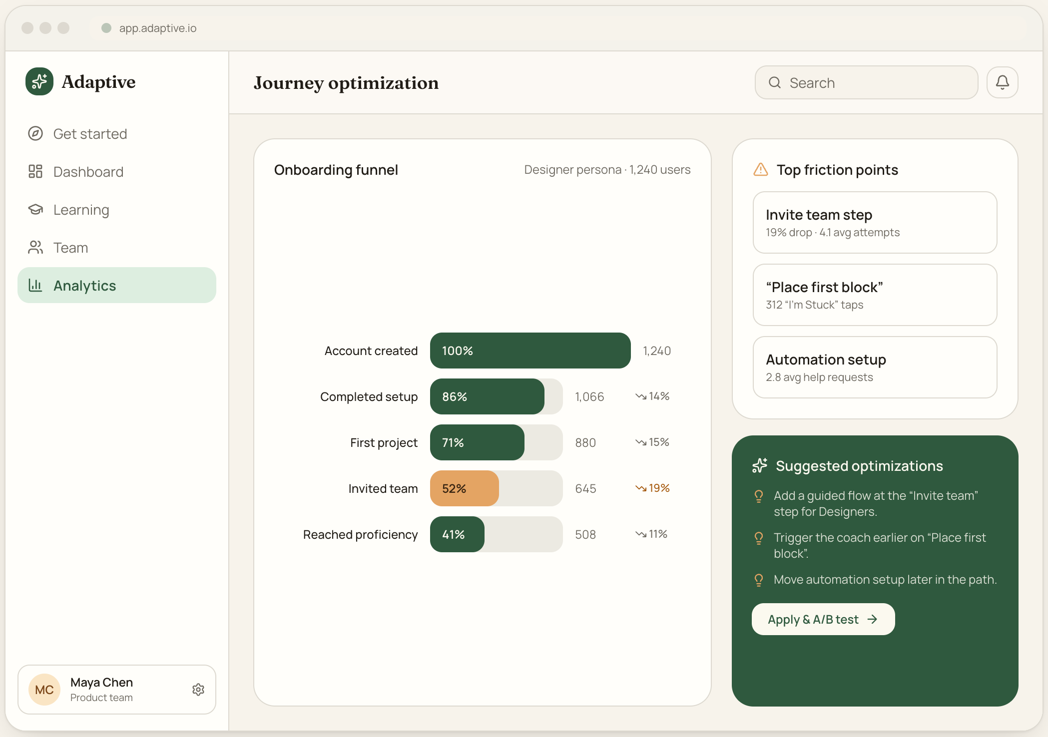
Journey optimization view
Turns funnel data into action. Drop-off is visualised per step, friction hotspots are ranked, and the system proposes concrete, testable optimizations to close the biggest gaps.
Key design decisions:
Funnel highlights the steps with the steepest drop-off in amber
Friction points quantified (attempts, "I'm Stuck" taps, help asks)
Recommendations are actionable and lead into an A/B test
Let’s talk about what you’re trying to solve.
I take a small number of new engagements each year. If your challenge sounds like the work above, I’d love to hear about it.