AI PRODUCT EXPERIENCE
AI Customer Success command centre, that turns noise into a clear next move.
CSMs don't lack data — they lack clarity. Pulse unifies CRM, product usage, support, and conversations that transforms Customer Success from reactive account management into proactive decision-makers and relationship builders.
THE QUESTION
Not “how can we help the CSM find information faster?” but “what customers need my attention, why, and what should I do next - letting me spend more time on our relationship?”
01
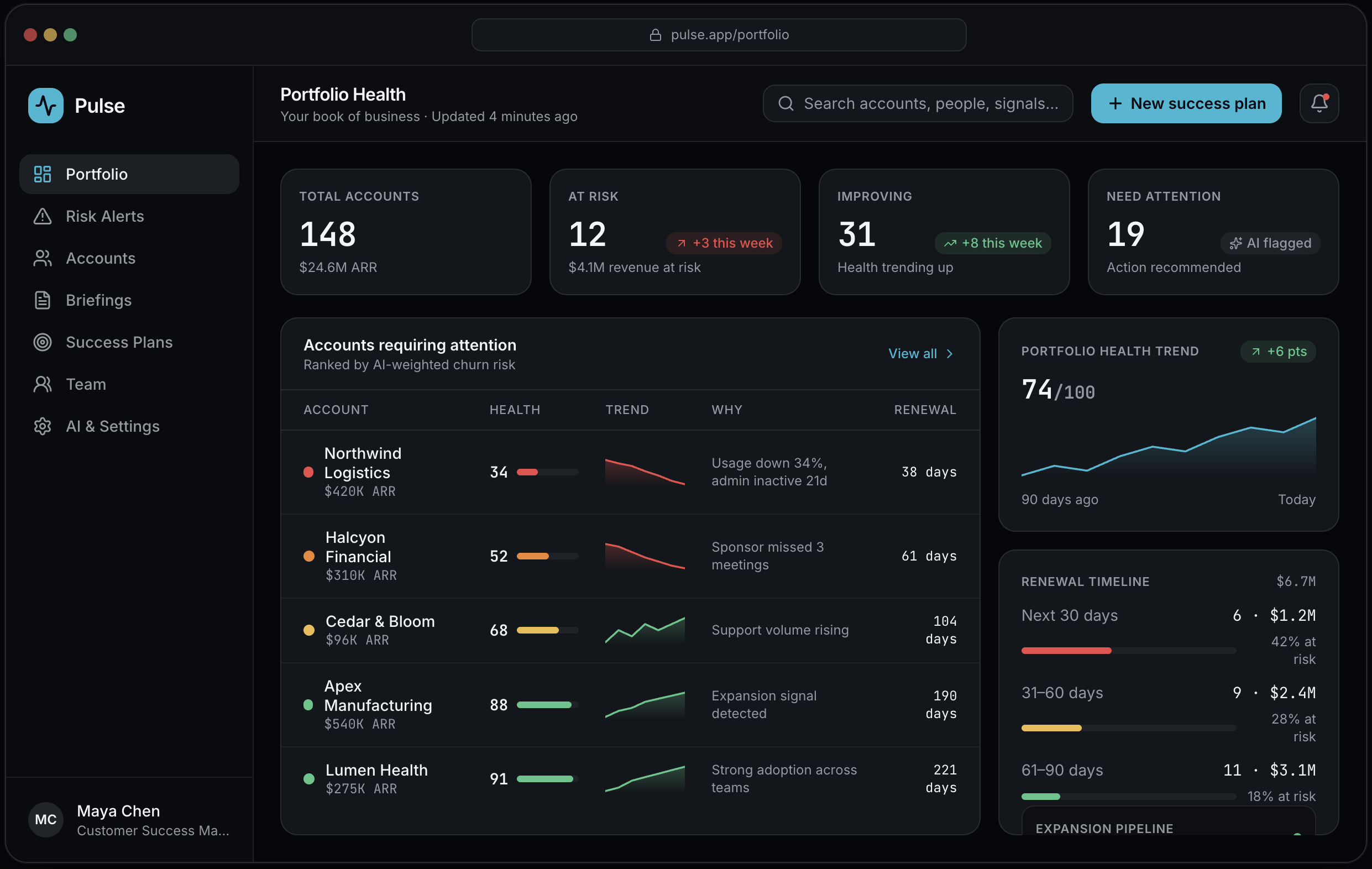
Portfolio health overview
The CSM lands on a single answer to "who needs me today?" — health, revenue at risk, renewals and expansion in one calm, scannable view.
Key design decisions:
Every account carries a Healthy / Monitor / At Risk / Critical status
Accounts are ranked by AI-weighted churn risk, each with a plain-language "why"
Renewal timeline surfaces revenue exposure before it becomes urgent
02
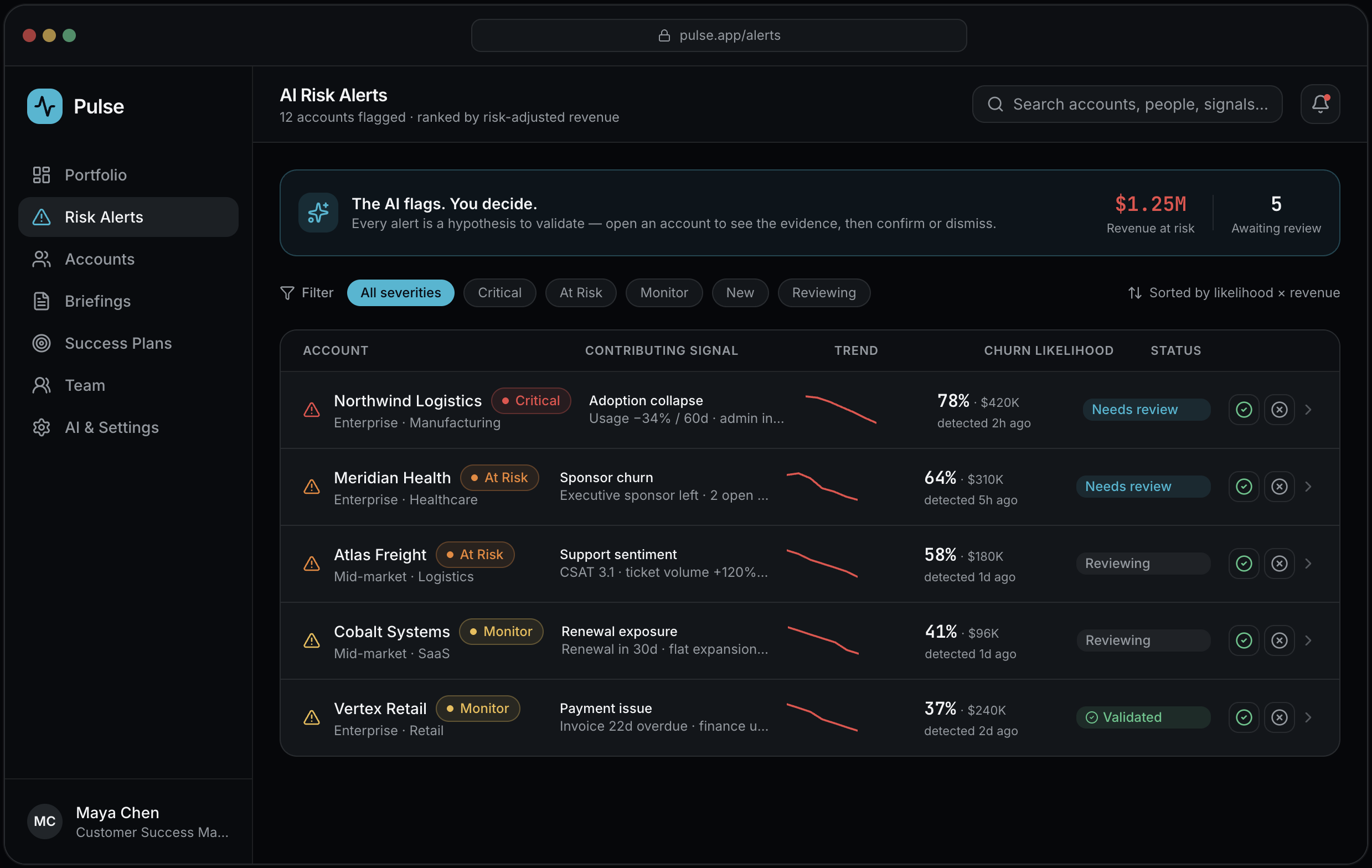
AI risk alerts
A prioritized queue of AI-detected risks across the portfolio. The flow is explicit: AI flags → CSM opens → validates → acts. The model proposes; the human disposes.
Key design decisions:
Alerts ranked by likelihood × revenue, so effort follows impact
Inline validate / dismiss keeps the human in the loop on every prediction
Each row states its contributing signal — never an unexplained score
03
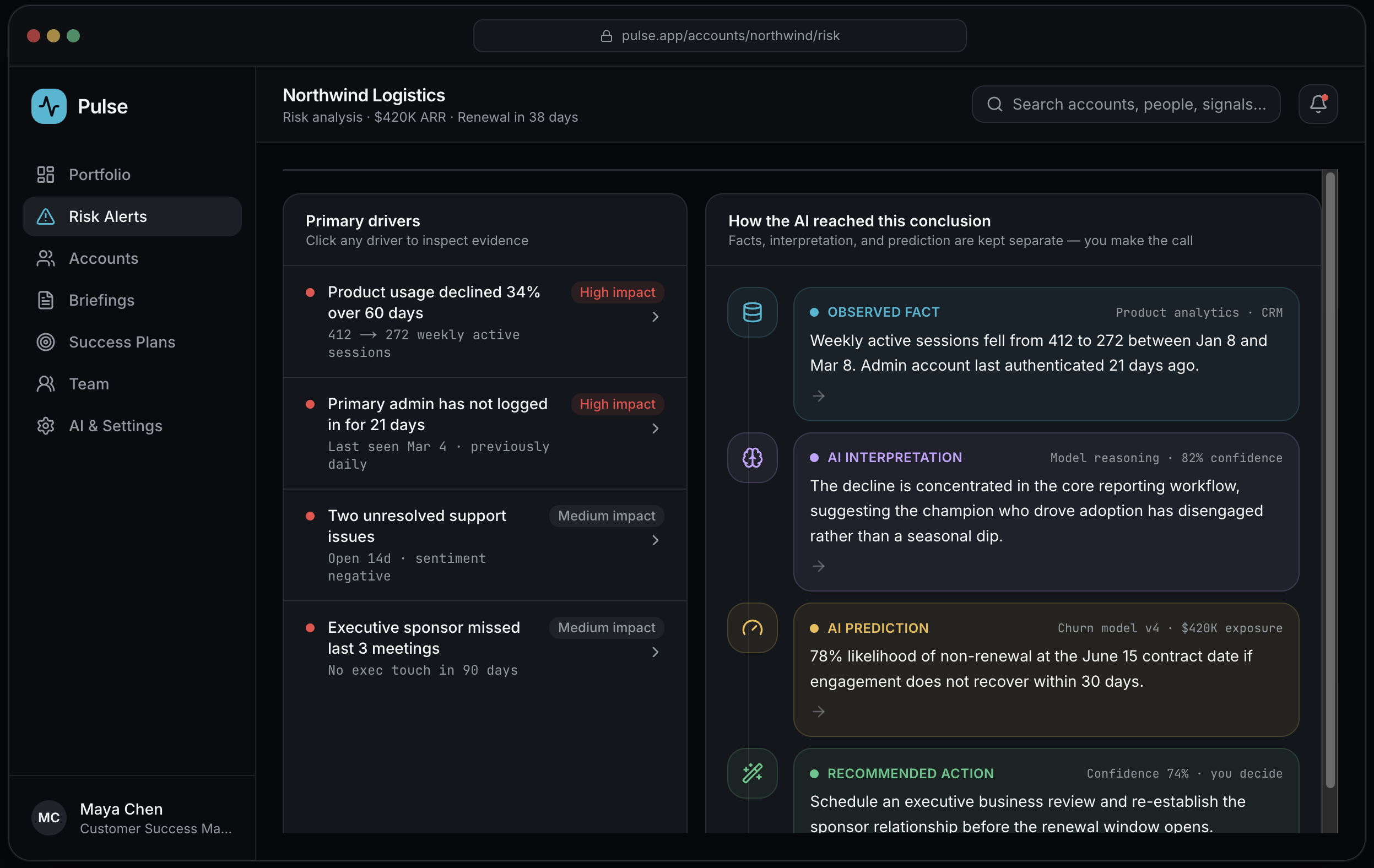
Why is this account at risk?
The explainability screen. Responsible-AI UX means never blurring what the system saw, what it thinks, what it predicts, and what it suggests.
Key design decisions:
Four clearly separated layers: Observed fact → Interpretation → Prediction → Action
Each driver is clickable to inspect the supporting evidence
Confidence and data sources are always shown — the human stays the decision-maker
04
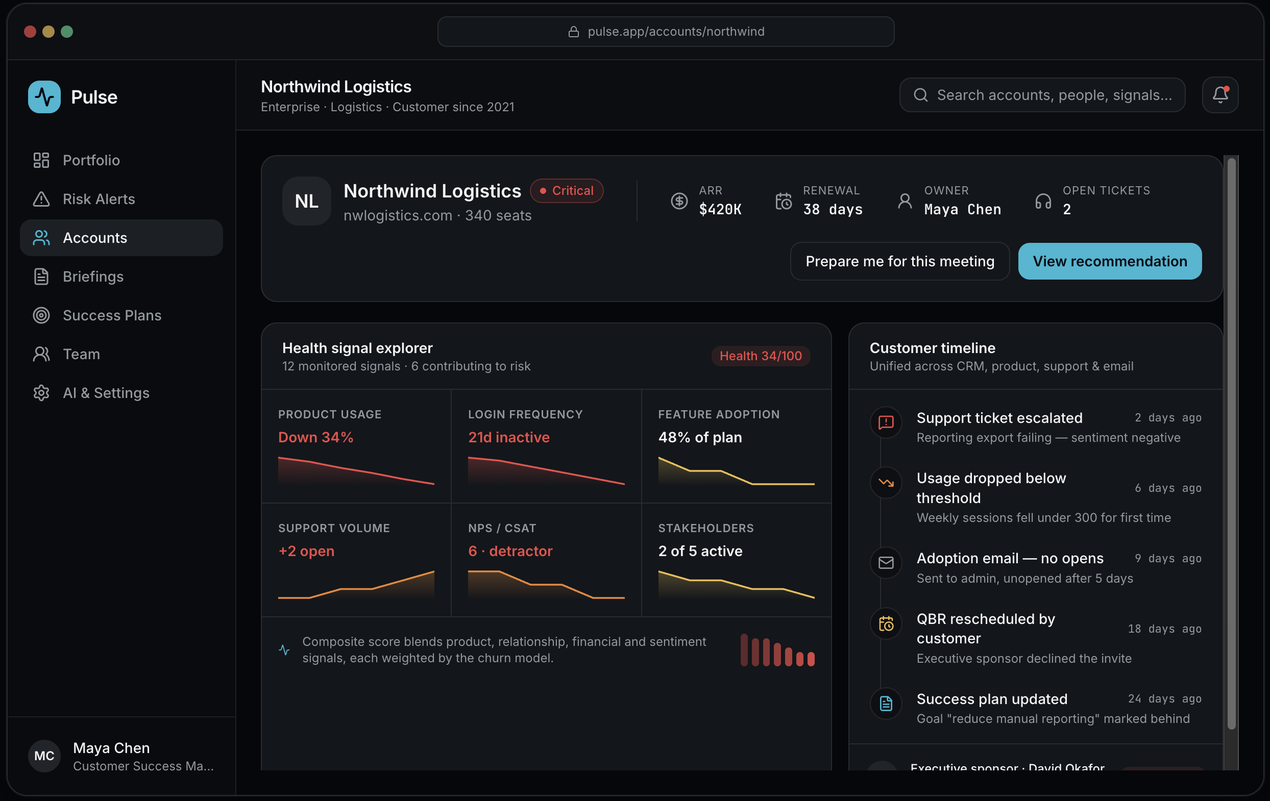
Account health & detail timeline
A deep dive that unifies fragmented signals — product, support, sentiment, stakeholders — into one narrative with a cross-source timeline.
Key design decisions:
Health signal explorer shows the 12 monitored inputs and which contribute to risk
Sparklines make direction obvious at a glance, not just a static number
Timeline stitches CRM, product, support and email into one story
05
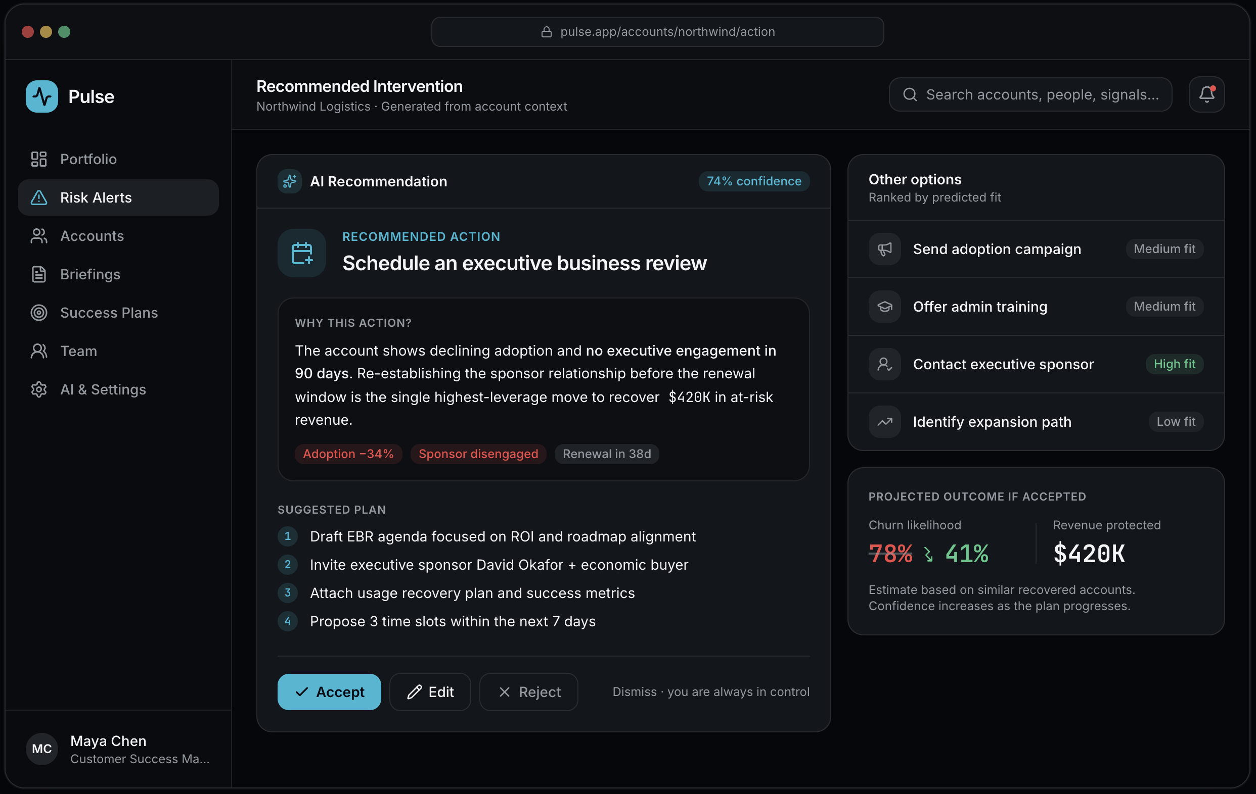
Recommended intervention
AI proposes the highest-leverage next move with its reasoning — and the CSM can accept, edit, reject or dismiss. The action is always a suggestion.
Key design decisions:
One primary recommendation with a transparent "why" and a suggested plan
Ranked alternatives and a projected outcome make the trade-off legible
A clear accept / edit / reject / dismiss decision bar keeps control with the human
06
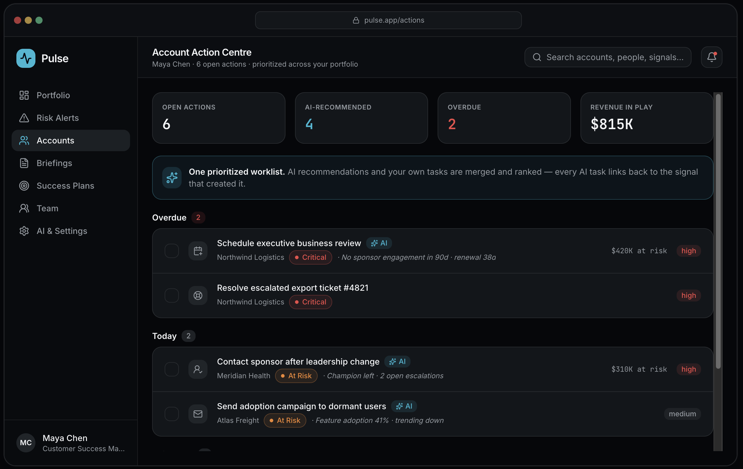
Account action centre
AI recommendations and manual tasks merged into one prioritized worklist, grouped by urgency — the CSMs single source of "what do I do next?"
Key design decisions:
Overdue / Today / This week grouping mirrors how CSMs actually plan
AI-generated tasks are tagged and trace back to the signal that created them
Revenue in play is shown per task so prioritization stays outcome-driven
07
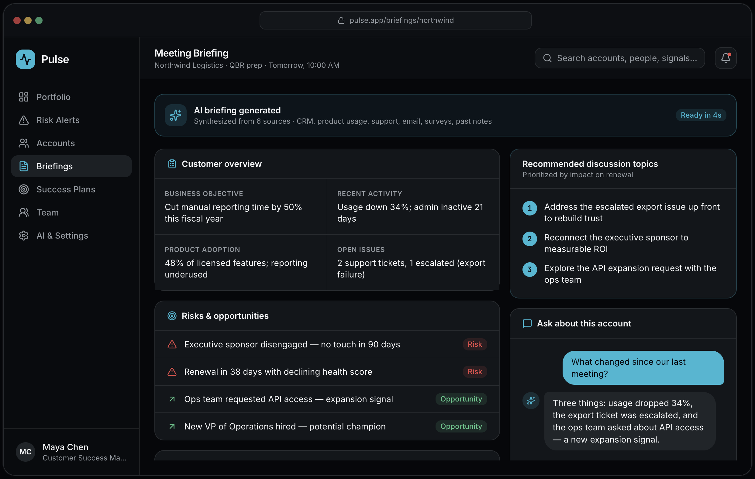
AI account briefing
"Prepare me for this meeting" synthesizes six data sources into a briefing — plus a conversational way to ask what changed and what matters most.
Key design decisions:
Overview, risks, opportunities and previous commitments in one prep sheet
Recommended discussion topics prioritized by impact on renewal
Ask-anything panel: "What changed since last meeting?" answered from account data
08
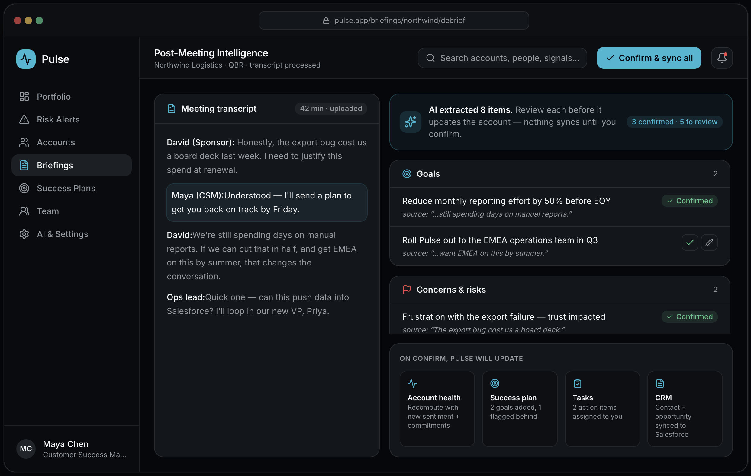
Post-meeting intelligence
After the meeting, AI extracts goals, risks, commitments, action items and expansion signals from the transcript — and nothing is written until the CSM confirms.
Key design decisions:
Every extracted item cites the transcript line it came from
A confirm / edit gate on each item keeps the human as the source of truth
"On confirm, Pulse will update" makes downstream effects fully transparent
09
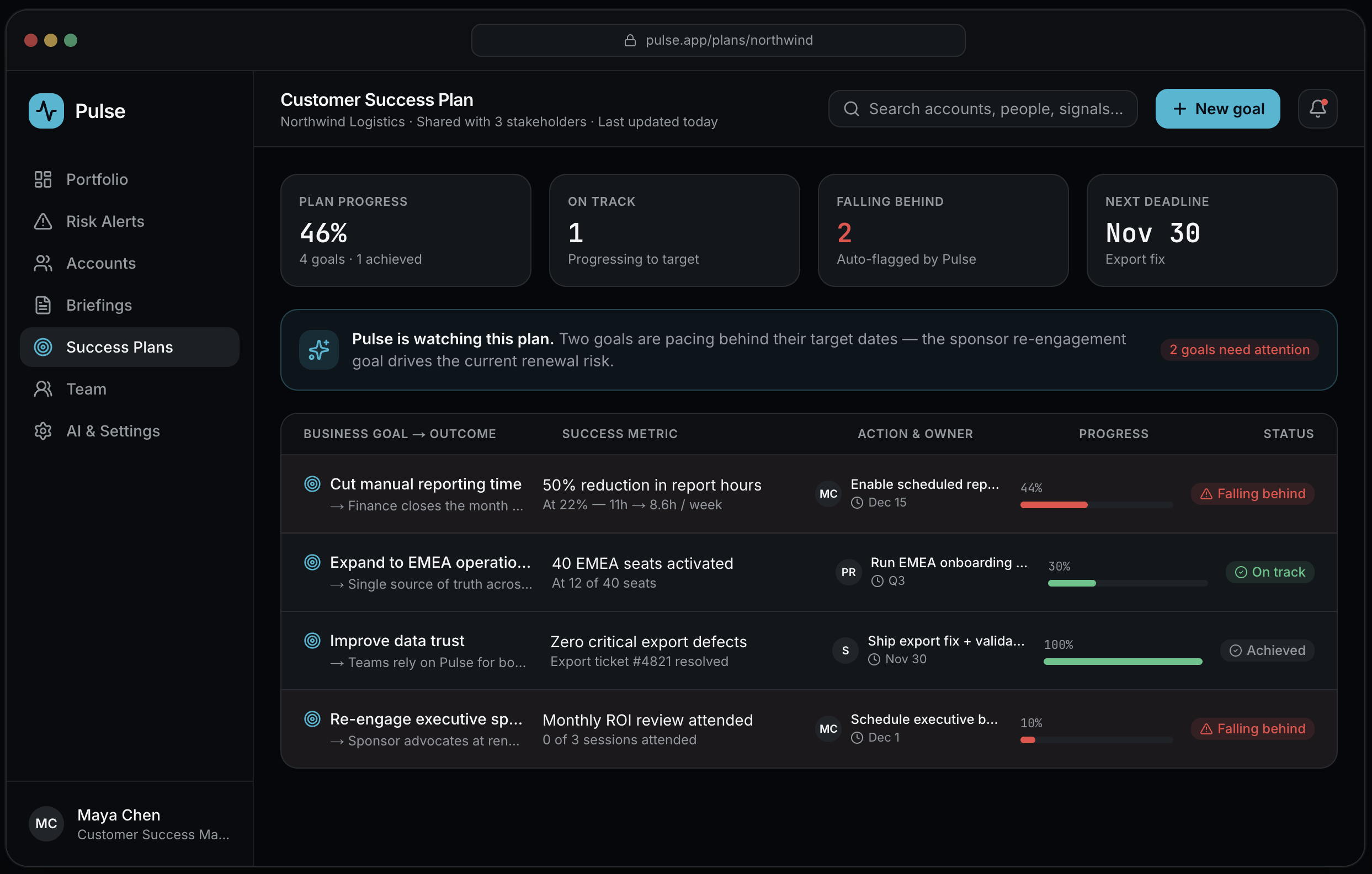
Customer success plan
A shared plan structured as Goal → Outcome → Metric → Action → Owner → Deadline, where Pulse automatically flags goals that are pacing behind.
Key design decisions:
The full chain from business goal to owned action is visible in one row
Goals falling behind are auto-detected and visually surfaced
Progress is measured against a metric, not a subjective status
10
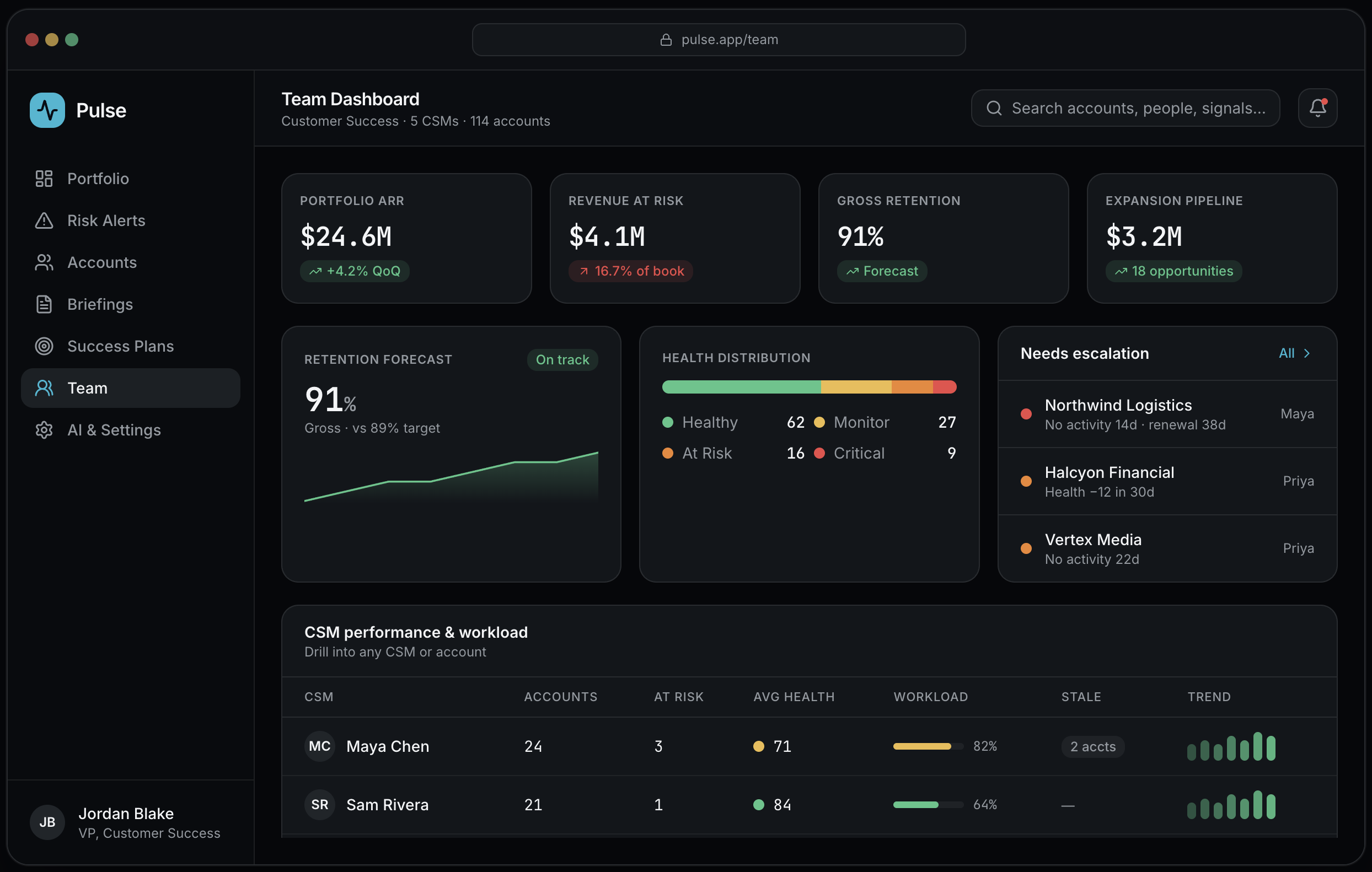
CS leader dashboard
Leadership visibility: portfolio health, revenue at risk, retention and expansion forecasts, and CSM workload — with drill-down to any account.
Key design decisions:
Revenue-at-risk and retention forecast framed for executive conversations
CSM workload and stale-account flags balance the team, not just the numbers
Escalation queue surfaces accounts slipping through the cracks
Let’s talk about what you’re trying to solve.
I take a small number of new engagements each year. If your challenge sounds like the work above, I’d love to hear about it.