PRODUCT & UX DESIGN ∙ AI PRODUCT EXPERIENCE
Designing an adaptive, AI-powered multilingual form experience
A low-code form and automation platform needed a better way for users to create forms for multilingual audiences. The challenge wasn't simply translating the form, it was helping users navigate the complexity of language configuration, translation, localization, and validation without requiring them to understand how the underlying system worked.
THE CHALLENGE
Creating a multilingual form can quickly become a technical task, where users need to think about:
Which languages to support
Translation quality and consistency
Regional formatting
Missing content
Validation and error messages
Language-specific variations
What should happen when translations are incomplete
For less experienced users, exposing all of these decisions upfront creates unnecessary cognitive load. How can we simplify localization for users who shouldn’t have to understand localization?
THE SOLUTION: A GUIDED AND ADAPTIVE WORKFLOW
The opportunity was to make the experience adapt to the user rather than forcing the user to adapt to the product. I designed a guided, adaptive workflow that uses AI to help users move from intent, to creation, to translation, to review, and to publish, while progressively revealing complexity as needed.
Step 1: Goal-Driven Form Creation →
Step 2: AI-Generated Form & Adaptive Guidance →
Step 3: Adaptive Multilingual Setup →
STEP 1: GOAL-DRIVEN FORM CREATION
One step at a time… starting with defining the user’s goal
Instead of beginning with an empty form builder and asking users to configure fields, languages, and settings, the experience starts with: “What are you building?”
Users describe what they're trying to accomplish, and AI uses that context to generate an appropriate starting point.
Users understand their business goal better than they understand the platform's configuration model.
Key design decisions:
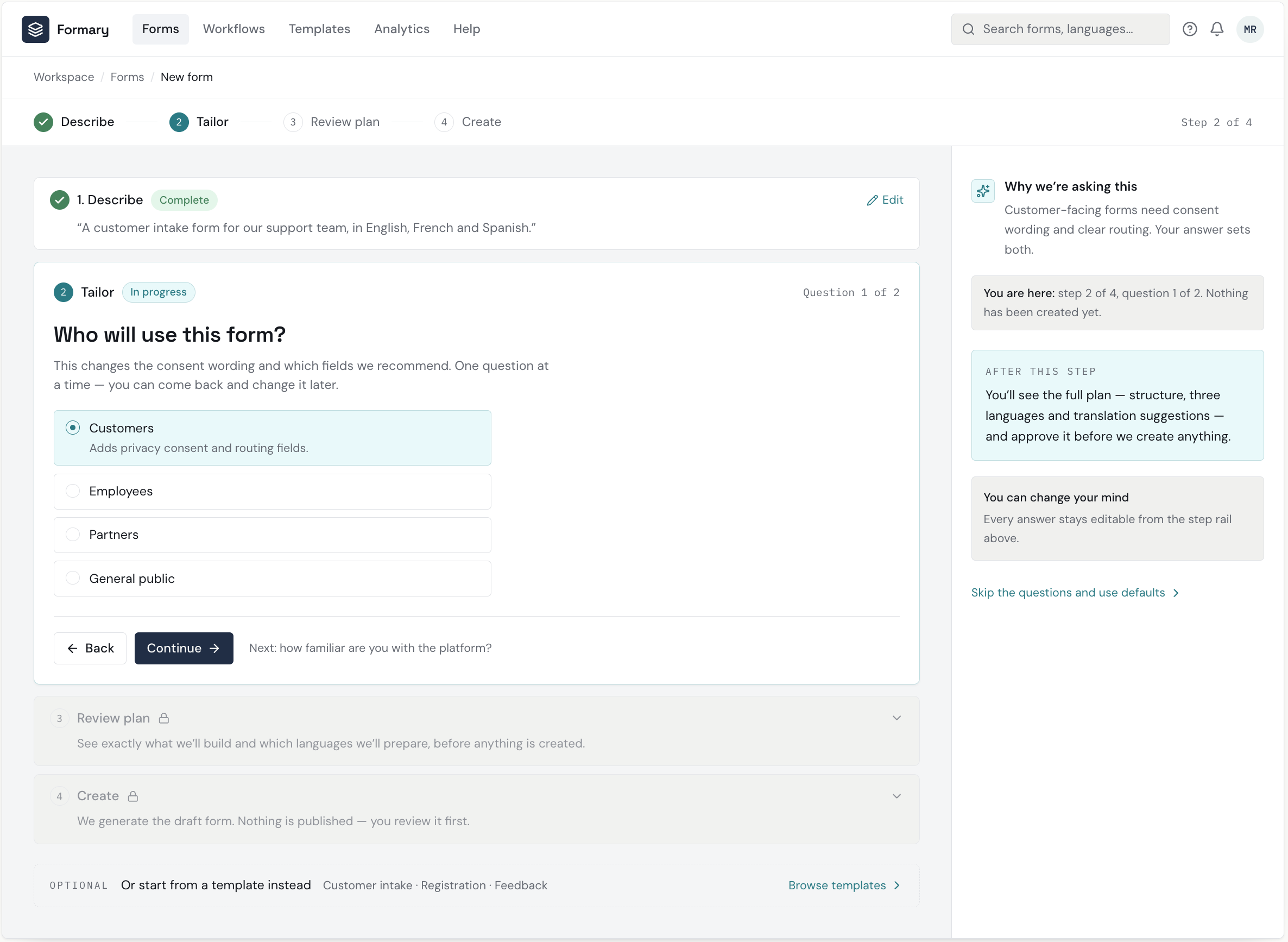
A persistent 4-step rail is the single source of truth for position; only the current step is expanded
Completed steps collapse to a one-line summary with an Edit affordance, so prior input stays visible but quiet
One question per screen with a ‘Question 1 of 2’ counter and an explicit ‘Next’ preview removes ambiguity about what remains
Progressive disclosure without hiding the path; future steps are shown locked with a plain-language description
The assistant panel narrows to why this question is being asked and what happens after, instead of the full plan
These design decisions allows for lower cognitive load for new or non-technical users.
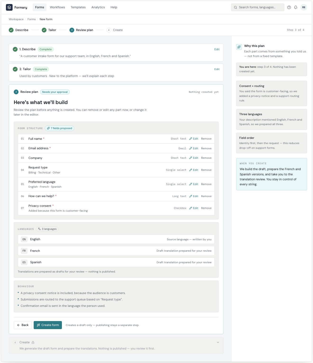
The user approves exactly what will be built before anything is created
Key design decisions:
The plan is grouped into structure, languages and behaviour, so the user reviews decisions rather than a flat field list
Every proposed field is individually editable and removable at plan time, approval is not all-or-nothing
Each behaviour rule states its cause ('because this form is customer-facing'), making the AI's reasoning auditable
'Nothing created yet' is repeated in the header, the button row and the assistant panel to remove any doubt about state
The primary action is 'Create form', explicitly labelled as producing a draft, publishing is never implied here
Steps 1 and 2 stay collapsed as one-line summaries so context is available without competing with the decision
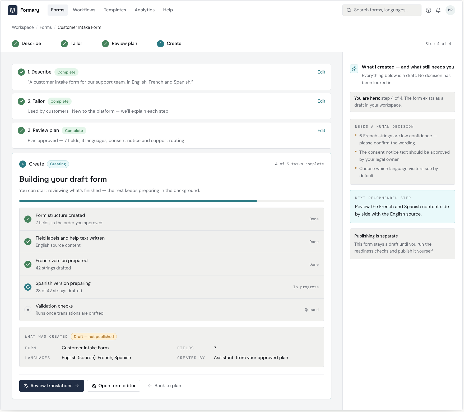
The draft is generated transparently, and the user is handed clear next actions
Key design decisions:
Creation is shown as an itemised task list, not an opaque spinner, so the user knows what exists and what is still preparing
Task states are text-labelled (Done / In progress / Queued) alongside the icon, never colour-only
'Draft — not published' chip on the result summary keeps the publish boundary explicit at the moment of creation
Why draft output: presenting the result as reviewable rather than finished keeps the user the decision-maker
The assistant separates 'what I created' from 'what still needs a human decision', turning AI output into a review queue
Two forward paths (review translations, open editor) plus a way back to the plan avoid a dead-end completion screen
STEP 2: AI-GENERATED FORM & ADAPTIVE GUIDANCE
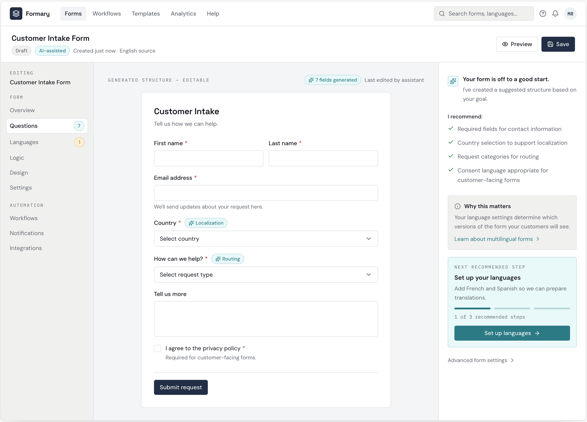
Use AI as a co-pilot, not an autopilot
AI helps generate the form structure, translations, recommendations, and quality checks, but the user remains in control.
The interface makes AI's role visible through:
Suggestions
Confidence indicators
Explanations
Review states
Accept / reject controls
Manual editing
Automation should reduce work without removing user agency or creating false confidence.
Key design decisions:
Every AI-authored element is labelled at the point of use, so provenance is obvious while editing
The structure is presented as editable draft output, never as a locked result
The assistant explains its reasoning as recommendations, keeping the user the decision-maker
A single 'Next recommended step' with progress dots directs attention without blocking other work
STEP 3: ADAPTIVE MULTILINGUAL SETUP
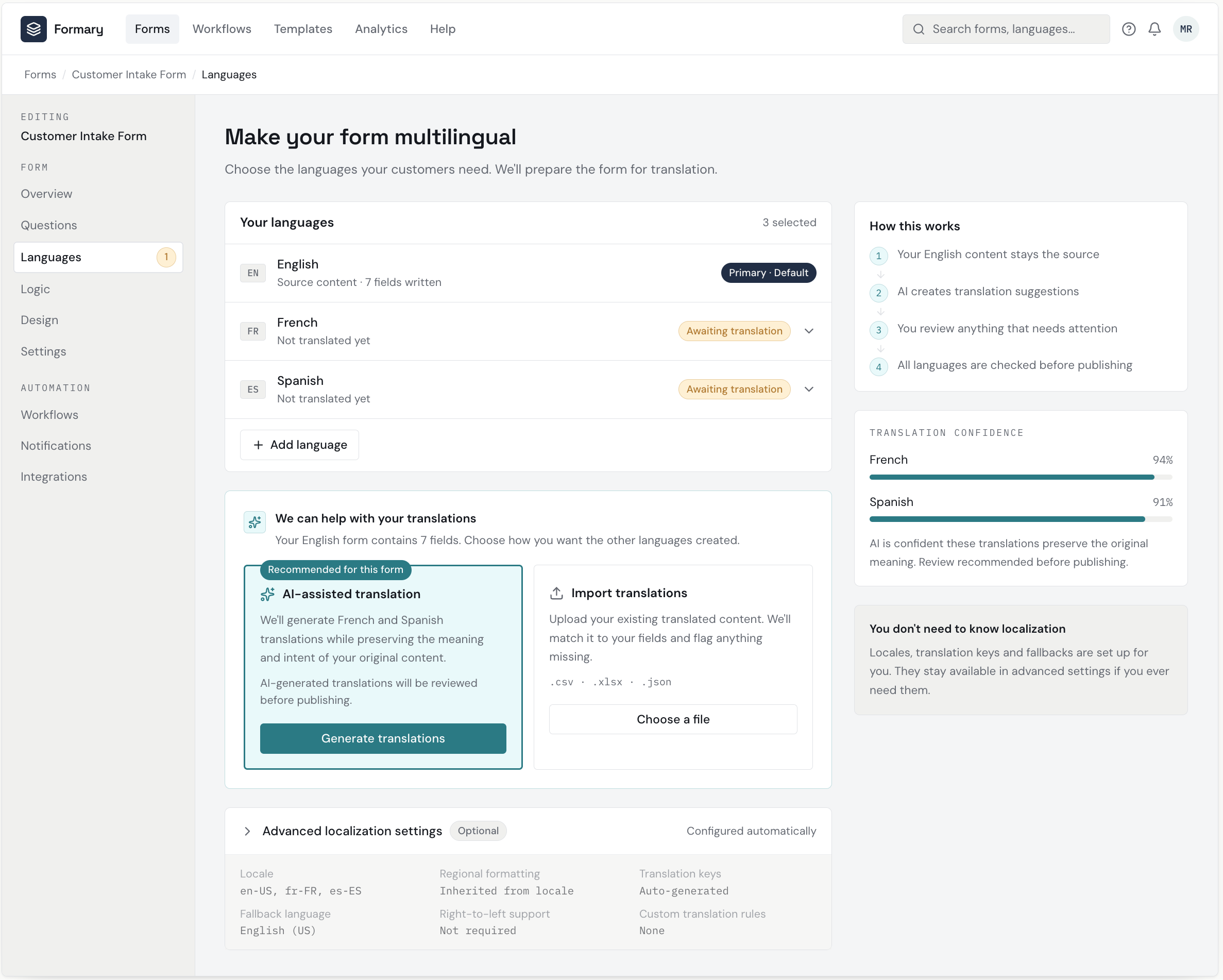
Make localization complexity progressive, so it’s a clear human decision
Rather than exposing localization settings immediately, the experience introduces complexity when it becomes relevant.
The primary workflow focuses on: Languages, Translations, Review, and Publish
More technical concepts, such as locale configuration, translation keys, fallback languages, and regional variants—remain available under Advanced settings.
Progressive disclosure keeps the experience approachable for new users while preserving power for experienced users.
Key design decisions:
Language choice is framed as an outcome ('who will see which version'), not as a settings toggle
Per-language state is text-labelled rather than colour-only, so status survives greyscale printing
Advanced localization options stay collapsed until they are relevant
The source language is pinned and visually distinct to anchor the translation model
STEP 4: MULTILINGUAL CONTENT REVIEW & AI ASSISTANCE
Adapt the experience to user expertise, and let AI assist the review; the user keeps final control
The workflow recognizes that a first-time user and an experienced builder shouldn't necessarily see the same experience.
For newer users, the interface provides:
Contextual explanations
"Why this matters" guidance
Recommended next steps
Examples
More visible AI assistance
For experienced users, the same workflow can become more direct, with faster access to configuration and advanced controls.
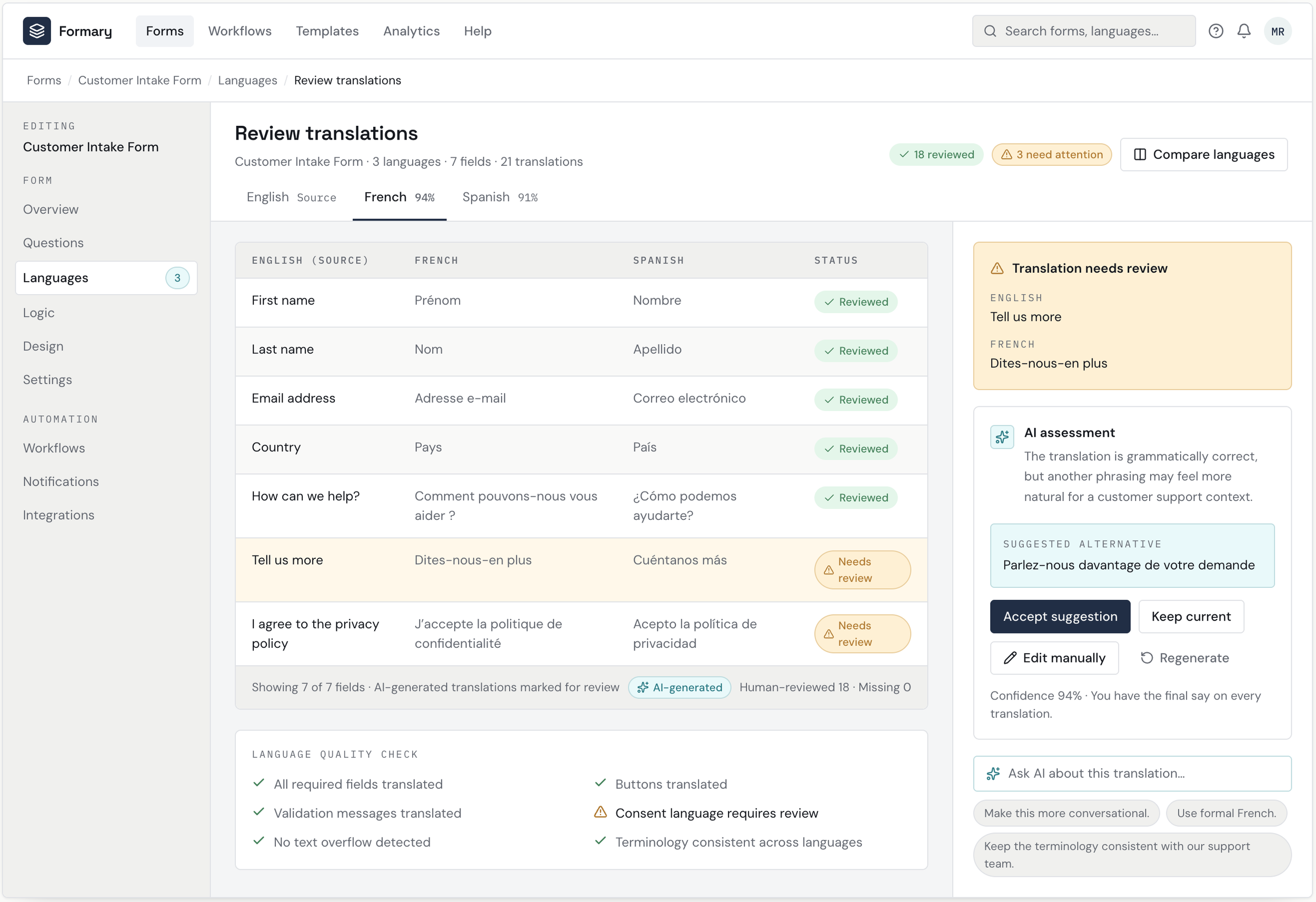
The workflow doesn't simply duplicate English content across three columns.
It helps users identify:
Missing translations
Potentially awkward phrasing
Inconsistent terminology
Regional formatting issues
Untranslated validation messages
Content that may require human review
AI can suggest alternatives while the user makes the final decision.
The best interface isn't necessarily the simplest one, it's the one that provides the right level of complexity for the person using it. A multilingual experience needs to preserve meaning, context, and usability, not just words.
Key design decisions:
Source and translation sit side by side so comparison needs no memory or tab switching
AI suggestions are proposals with accept/edit actions, and nothing is applied silently
Confidence and issue flags are surfaced per row so attention goes to the risky strings first
Bulk actions exist but are secondary to per-string review.
STEP 5: ADAPTIVE VALIDATION & PUBLISH READINESS
Validate the experience before publishing
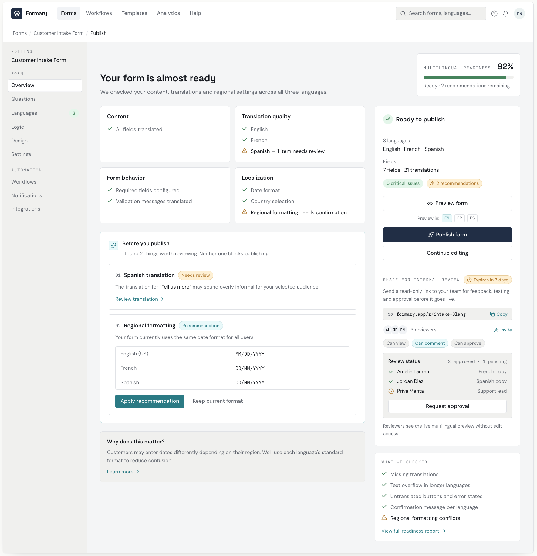
The final step isn't simply: Translations complete = Publish. Instead, the system provides a multilingual readiness check.
It surfaces issues such as:
Missing translations
Translation quality concerns
Untranslated system messages
Regional formatting problems
Inconsistent terminology
The user gets a clear distinction between critical issues and recommendations.
Catching problems before publication reduces errors, support dependency, and user frustration.
Key design decisions:
A readiness score plus itemised checks answers 'can I publish?' in one glance
Blocking issues are separated from advisory ones, each with a direct path to the fix
Preview sits alongside Publish with per-language switches, so the user can verify before committing
Internal sharing (link, reviewers, approval status) turns review into a first-class step rather than an email round-trip
Publishing stays a deliberate, explicit action — no auto-publish anywhere in the flow
Let’s talk about what you’re trying to solve.
I take a small number of new engagements each year. If your challenge sounds like the work above, I’d love to hear about it.